Cohesive agency icon set
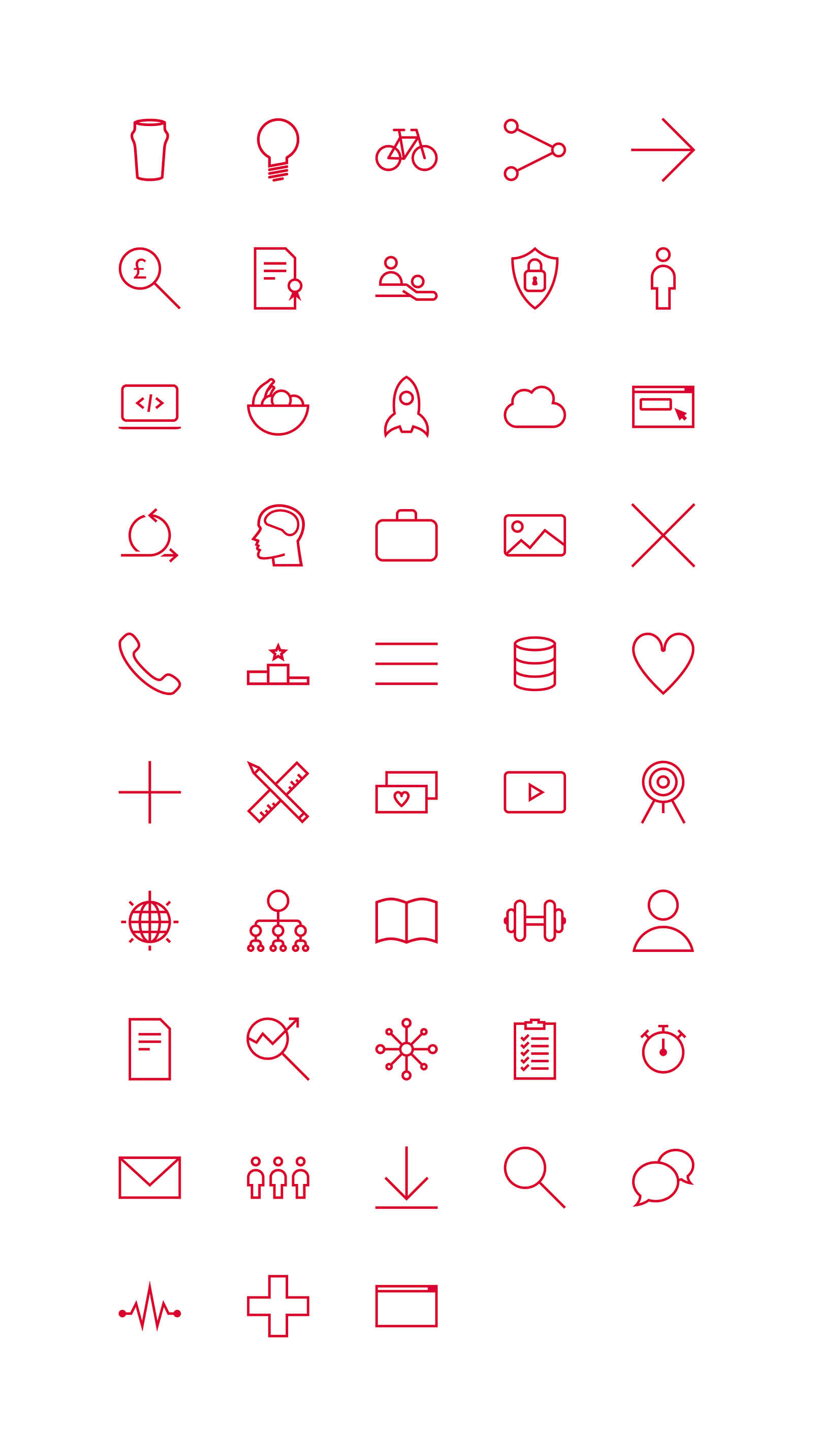
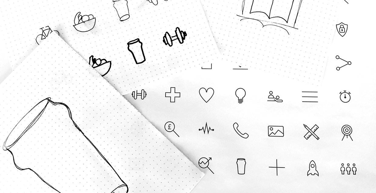
We needed a cohesive visual language to represent various areas of the agency for use in printed collateral, presentations and on the web. I created a range of icon glyphs that could be expanded in the future.
Grid system
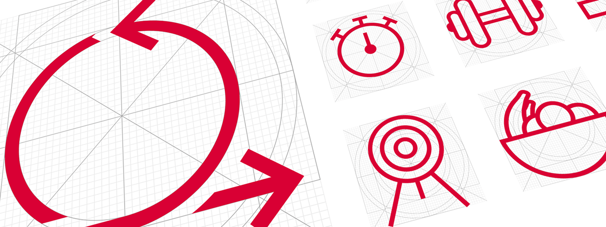
Similar to how Apple created a grid system for iOS app icons in the iOS Human Interface Guidelines I created a custom grid system to control the layout and stroke weight of each glyph.
The four pillars
The four pillars represent the key services of the agency. Online marketing, design, development and digital consultancy.

Staff benefits
Glyphs to represent staff benefits were created including the cycle to work scheme, fresh fruit, gym membership and the beer fridge.

48 icons and counting…
